Training the bystander : Universal design
Client
Self-driven passion project
Duration
3 months
Team
Gautham Ravikiran
My role
UX Researcher, Visual Designer
This passion project explores a conceptual feature design for iOS mobile devices. Its main functionality is to help guide the layperson in performing CPR on the spot.
Project Overview
// problem
People often lack the awareness, guidance, and tools needed to perform basic life-saving actions in critical situations.
// Solution
First Aid+ UI design
Symptoms for recognition
Siri enabled EMS contact
CPR Animations
Dynamic Island notifications
The FirstAid+ solution addresses scenarios where individuals encounter sudden medical emergencies in everyday settings. For example, consider a middle-aged bystander waiting at a bus stop after work who suddenly collapses, clutching their chest. In such high-stress situations, untrained individuals often lack the knowledge or tools to act effectively while waiting for professional help. FirstAid+ is designed to empower bystanders with clear, accessible guidance to provide prompt assistance, potentially saving lives before medical help arrives.
Context
Physical environment and context of use
Research Process
The project is set in the context of India, which is a developing nation. There are no formal trainings offered for the citizens about basic life saving techniques. The project began with a quantitative survey trying to understand the landscape and assess the CPR knowledge gap. I then moved forward with a hospital visit and conducted interviews with first responders to understand how they tackle this challenge.
Literature review of Indian landscape
Online survey with 62 participants
User Interviews with first responders
Site visit to Hi-Tech Hospital in India
Methods used
Key Insights from research
ONLY 18 out of 62 participants can perform CPR
58 out of 62 of participants are aware of CPR and willing to learn how to perform it
Preferred mode of learning is through video tutorials
First responders verbally guide bystanders to perform CPR
Ambulance delays occur mainly due to traffic conditions
// survey findings
// Hospital visit & Interview findings
Hi-Tech Hospital in Bangalore
“Traffic is the main issue with delays in ambulance arrival times and is outside our control”
“Verbally guiding the bystander is always difficult, especially when they don’t have formal BLS training”
“We train all doctors and nurses with BLS every month as a refresher”
5 major challenges
01
Inability to perform CPR
02
Lack of awareness about AEDs
03
Language Barriers for training
04
Expensive costs of training
05
No basic healthcare education
To design an accessible, user-friendly, and reliable guidance system that empowers bystanders to perform basic life-saving actions in emergency situations.
Design Goal
Design Deliberations
-
The interface must cater to diverse users, including those with varying levels of literacy, language proficiency, and physical or cognitive abilities. During my preliminary research, I identified that existing tools often exclude users due to complex terminology or lack of multilingual support.
-
Literature studies showed that simplicity and clarity are essential in high-stress emergency scenarios. I want to avoid overwhelming instructions or unclear visuals that may delay action.
-
A reliable system ensures that users trust the guidance provided. This includes clear instructions verified by medical experts and a robust, responsive interface that functions well under various conditions, such as poor lighting or low internet connectivity.
-
The goal is to instill confidence in untrained individuals to take action without hesitation. Psychological studies reveal that fear of making mistakes often paralyzes bystanders.
-
The system is tailored to critical, time-sensitive interventions such as CPR. Research shows that bystanders equipped with immediate, actionable steps significantly improve outcomes before professional help arrives.
Initial Ideas
I began ideating on paper, trying to sketch out the interface keeping in mind, the critical decisions the user needs to make. I decided to go with an integrated solution on the medical ID features of mobile phones instead of creating an entirely new application that people need to download.
This is because, an emergency feature is available on every mobile device increasing the reach and accessibility of this solution to almost everyone. For the sake of this project, I decided to design for iOS devices due to its simple and straightforward interface.
Sketching ideas
First version wireframes & Feedback
Initial Wireframes with peer feedback
It was important to create illustrations that are gender neutral, clear and at the same time visually depict the CPR procedure.
This was one of the most challenging parts of this project. To make the process clear, I decided to use simple, and clear animations supported by minimal text to
Illustration style
Creating the illustration style
To test if my illustrations will be visible for the color blind, I ran the image through an accessibility checking website. This helped identify whether the illustrations are easy to comprehend by colorblind people as well.
Accessibility check
Accessibility check results - Illustrations are visible clearly for all
Hi-fidelity Wireframes
Hi-fidelity wireframes with illustrations
Introducing First Aid+
I decided to name the new feature as First Aid+. This new feature is strategically positioned under the medical ID feature of the Health app.
It contains comprehensive instructions on first aid procedures specifically for life threatening emergencies such as, Heart attacks, Strokes, Burn Injuries and more.
CPR Steps visually explained
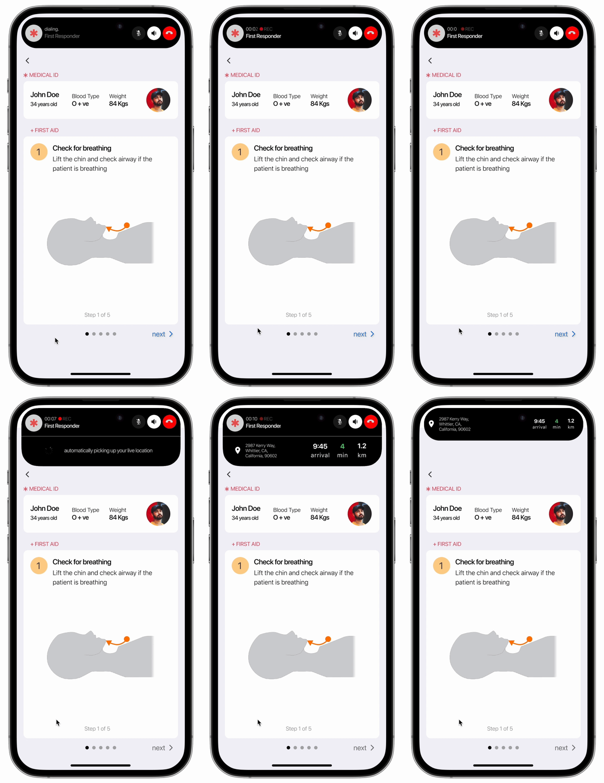
The procedure starts off by asking the user to check for breathing, while a call to EMS is placed automatically, picking up the user’s location.
Step 1
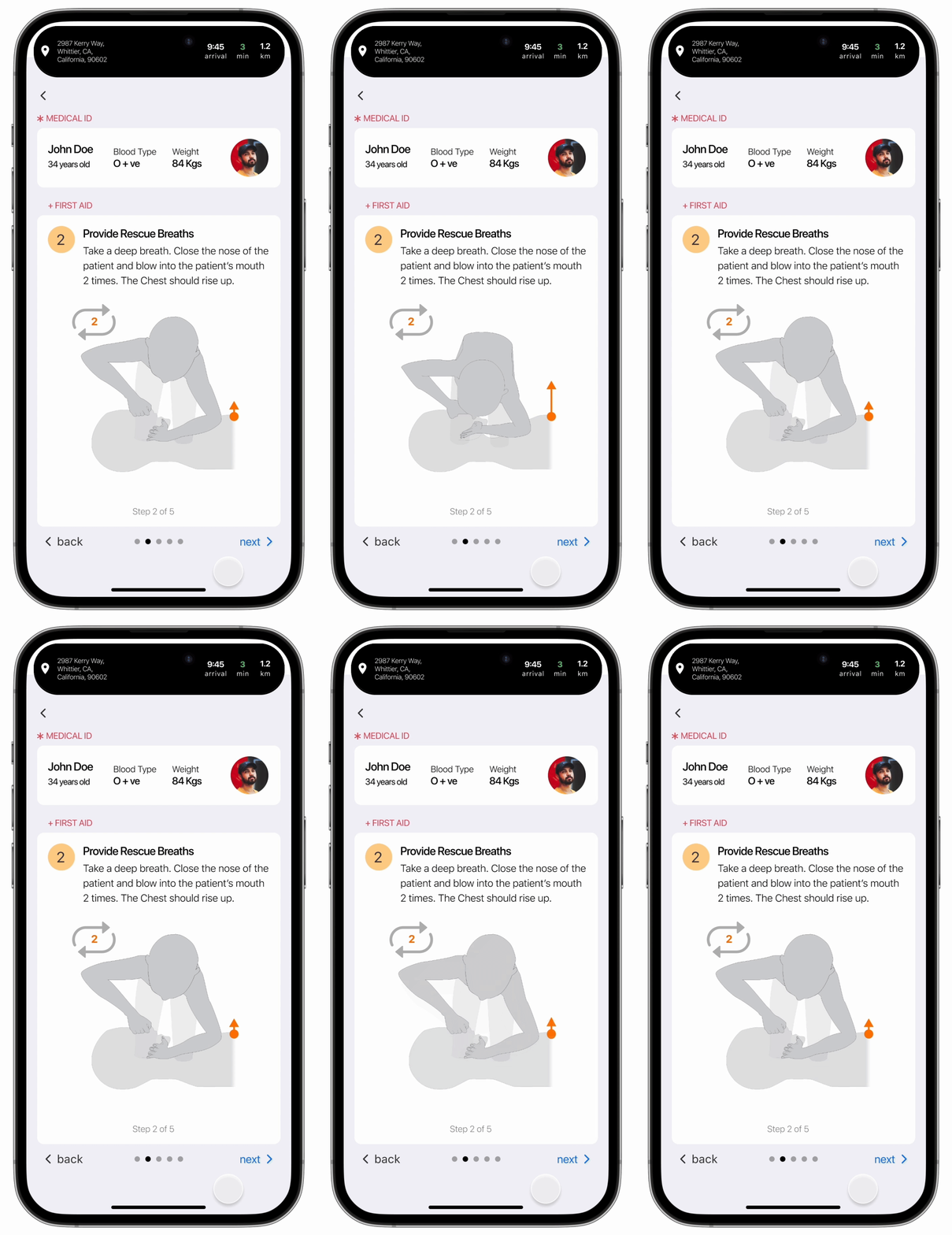
Then the user is asked to provide rescue breaths to keep the brain oxygenated. The ETA for EMS is displayed on top of the screen.
Step 2
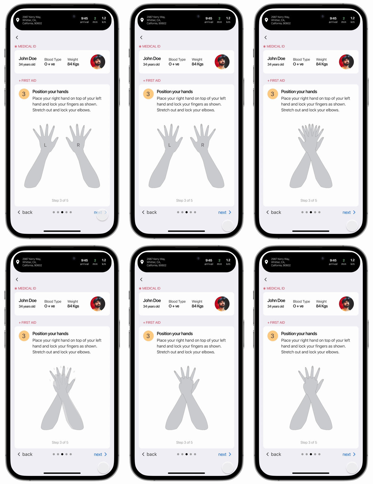
Step 3
The user is visually guided on how to position their hands for providing chest compressions. The medical ID is available at the top with the name of the user and other important information.
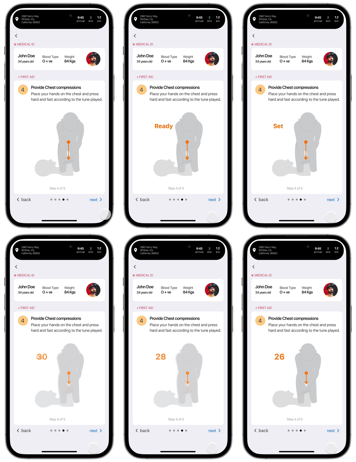
Chest Compression should be performed at a particular pace for which a count down with visual and audio cues are provided to help the user start and keep up the pace.
Step 4
The final step of providing CPR is to repeat the rescue breaths and the chest compressions until emergency services arrive. The user will be notified once EMS arrives
Step 5
Scaling the feature
Though heart attacks are one of the many different life threatening emergencies, there are various other first aid measures that can be included within this feature for different cases such as strokes, burn injuries, fractures & sprains and many more.
This is how we could scale this feature and educate the common person about basic life saving techniques in developing nations and make this a safer and better place to live in!
Accessing this feature
Final Reflections
I learnt the importance of early feedback and iterations, as it helped me avoid putting a lot of effort onto prototyping and animating unnecessary parts of the design.
I learnt how to test my designs for accessibility. Upon later reflection and research, I understood that it can be done with a figma plugin.
Learnings
Designing for accessibility is interesting but at the same time difficult since we need to consider a wide user group.
Testing the feature was extremely difficult and not included in this project due to the nature of the use case it is designed for.
Challenges
The current design works under the assumption that people have access to phones and are willing to help. User interviews on willingness to help can further solidify this concept.
The design is made for iPhone users, further exploration must be made for android users as well.


